Excel spreadsheets are still one of the most extended ways of working with big collections of data, especially among non-technical users. Two of our Vertical Packs, Voice of the Customer and Voice of the Employee, are particularly useful for typically non-technical teams, which can now carry out their analyses easily with our last Excel integration.
In this tutorial, we are going to show you how to use the add-in provided in the Voice of the Customer Vertical Pack, how to carry out a VoC analysis, and how to work with its output by creating a dashboard like the one on the right. Working with the Voice of the Employee Pack would follow a similar pattern.
[This post was last updated in February 2019 to include the updated ontology.]
A practical case
Let us imagine we work for a market research department or agency interested in analyzing the Insurance industry. Customer comments in forums and social networks constitute an extremely valuable source of spontaneous information about their opinions about insurance providers.
We are going to focus specifically on auto insurance reviews extracted from ConsumerAffairs, a website that collects reviews from several domains.
The reviews we are going to use have been extracted from the top five companies in the Auto Insurance section: for each one of them we’ve picked ten items. You can download here the Excel spreadsheet we will be working on. It contains a single sheet where we have included two columns: one with the selected reviews, and another with the name of the company they refer to.
As we have mentioned, for this tutorial we are going to use our Vertical Pack for Voice of the Customer analysis. Vertical Packs are a combination of preconfigured models or dictionaries, powerful APIs and specific add-ins for Excel that enable you to adapt text analytics to your domain with only one click. Just by registering at MeaningCloud, you have a 30-day trial for all Vertical Packs available. The trial starts the moment you first analyze a text, so users that have been using MeaningCloud for a while will also be able to try it out.
To get started, you need to register at MeaningCloud (if you haven’t already), request access to the Voice of the Customer pack and download and install the VoC Excel add-in on your computer. Here you can read a detailed step by step guide to the process.
Step 1: obtaining the VoC analysis
Once you’ve installed the add-in, a new tab called MeaningCloud VoC will appear when you open Excel. If you click on it, you will see the ribbon on the right. To start using the add-in, you need to copy your license key and paste it into the corresponding field in the Settings menu. You are required to do this only the first time you use the add-in, so if you have already used it, you can skip this part.
In the Settings section we will also do the following:
- In the General settings section, uncheck the “Combine cells in the output” checkbox.
- In the VoC Analyses Output section, leave checked the fields Dimension, Label, and Polarity.
Once the settings are configured, you just have to select the data you want to analyze and click the “Voice of the Customer” button. In the dialog that appears, we will define the company column as the ID, English as the language, Insurance as the analysis domain and then we will click on Analyze. If you have any doubts about the data selection, check our previous tutorial on getting started with our add-in for Excel.
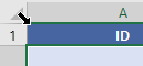
The resulting table will have five columns: ID, Text, Dimension, Label, and Polarity. It will look like this:
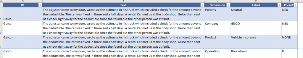
The ID and the Text are extracted from the input selected for the analysis. In Dimension, we find the various aspects we are analyzing in the feedback and correspond to the first-level categories assigned to the text. The Label contains the name of the category, and Polarity gives us a polarity value associated to the category. This last part is important, as in Voice of the Customer models we also categorize according to the global polarity of the text.
Step 2: preparing the data
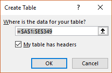
Once we have the results, we will select them (including the headers) and add them to a table. To do so, we just need to click Insert, and then Table. A dialog to confirm the range of the table and if it has headers will appear, and the results will be converted into a table.

The Design tab is selected automatically, allowing you to set a name for the table in the Properties section. We will call our table “VoC“. This will permit us to refer to the results without worrying about the specific range of cells; in this way, reusing the dashboard with other sets of data will be easier.
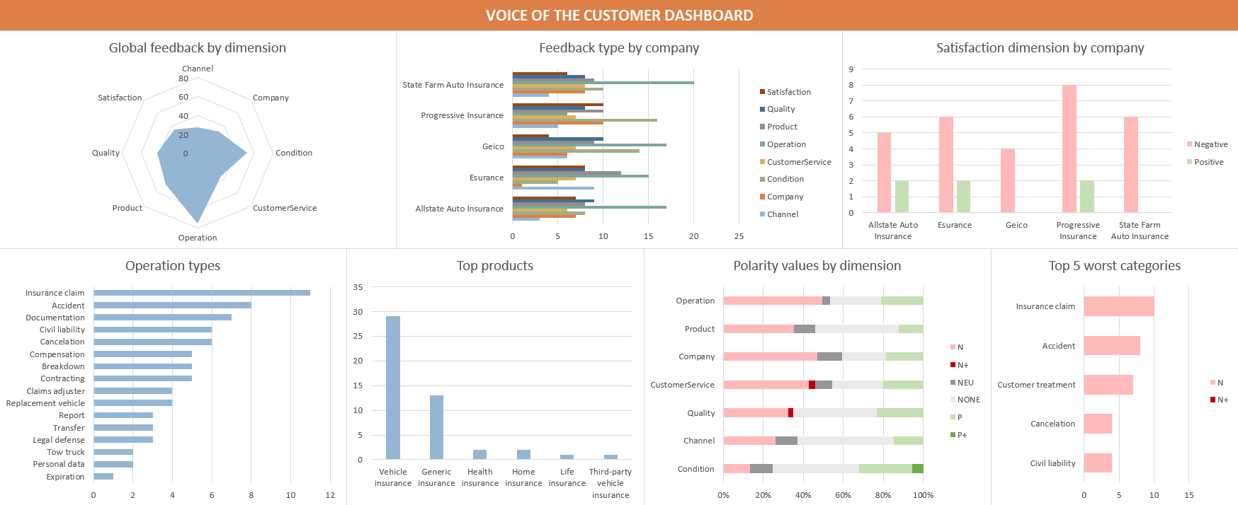
As we have seen before, the dashboard consists of some charts that will give us an overview and some interesting insights of the Voice of the Customer analysis.
The dashboard we are going to use here is just an example of what you can do, a way to familiarize ourselves with the data returned by this type of analysis. As you keep working with the Voice of the Customer analysis, you will be able to adjust the dashboard to show your KPIs (Key Performance Indicator) or any other insight you want to extract.
Step 3: creating the first chart
Global feedback by dimension
In this first approach to the Voice of the Customer analysis, the first thing we need to understand is the type of output provided. If you’ve taken a look at any of the Voice of the Customer models, you might have noticed that the different categories are grouped by dimensions.
The first chart we are going to create will display the distribution by dimension of all our data. It will give us a general idea of what customers are talking about.
To create this chart, we will select the VoC table (you can easily do it by going to the top-left part of the table and clicking where the diagonal arrow appears) and then click on the PivotChart button in the Insert tab.
As we have selected our VoC table, it will appear preselected in the Create PivotChart dialog as the data to analyze. After clicking on OK, we just have to configure the fields we will use in the chart.
For this chart, we will add the field Dimension to Categories, and Count of Label to Values. Then, in the Design tab, we will click on Change Chart Type and select Filler radar.
We can change the style of the chart to make the information easier to understand, either by using Excel’s predefined chart styles or by modifying the different chart elements as needed. In this instance, we will add a title (Global feedback by dimension), remove the legend and hide all field buttons in the chart.
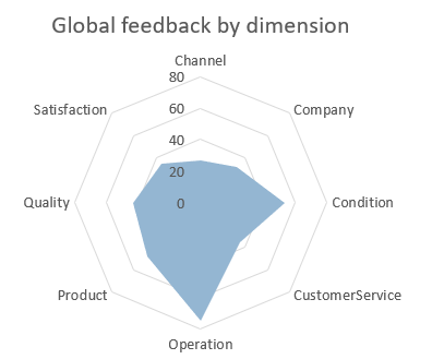
If we look at the chart, we can see that there are two dimensions that are clearly mentioned by customers more than the others: Condition and Operation. The last thing to do before adding our chart to the dashboard is to name the sheet, GlobalFeedbackByDim.
Step 4: create the dashboard
The dashboard will have its own sheet, so we will create a new sheet named VoC Dashboard.
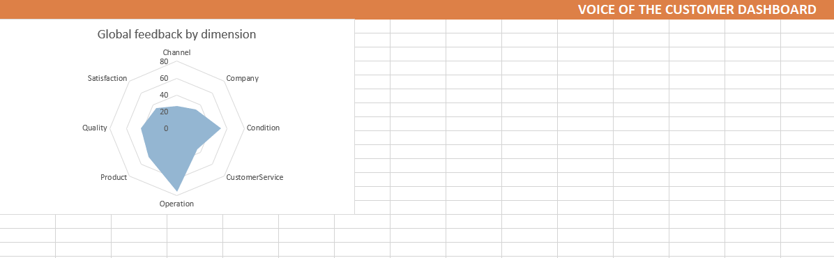
The first row will be used to set a header for the dashboard, while we will use the rest to add the charts that will compose it. To set the title, we will select the first row from column A to column Y (the size needed may vary depending on the type of chart), we will merge the cells and write “Voice of the Customer Dashboard”. To make it more visible, we can increase the font size and add a different style to the cell (in our case we’ve selected the Accent2 predefined style).
Once we have the header, we can go back to the GlobalFeedbackByDim sheet, and in the Design tab, click on Move chart and select Object in: VoC Dashboard to move it to the sheet we’ve just created. When we resize and place the chart as we need, the result will look like this:
Step 5: adding more charts
To add the rest of the charts to the dashboard, we will follow a process similar to the one described for the first chart:
- Select the Voice of the Customer table
- Add a new pivot chart
- Select the information you want to show
- Modify the style to make it easier to understand
- Move the chart to the dashboard
These are the charts we are adding to our dashboard and why we’ve chosen them:
Feedback type by company
After seeing the kind of feedback we have for all the analyses, we need to see if a same type of distribution is maintained for the different companies considered. To do it, we will insert a new Clustered bar chart with the field ID in Categories, the field Dimension in Series and the Count of Label in Values.
In this new chart, we can see that the distribution is quite consistent between companies, although there are some differences: Progressive insurance has fewer mentions of operations than the others, while in the feedback for Esurance it’s rarer to see other companies mentioned.

Satisfaction dimension values by company
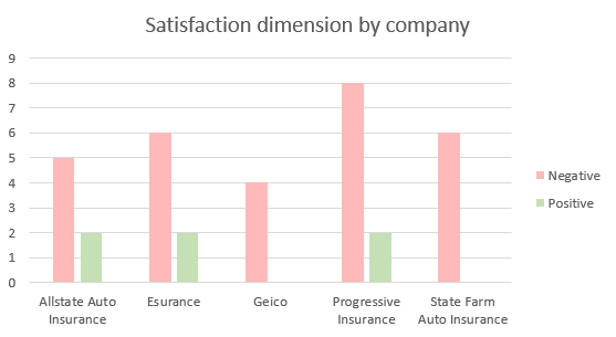
Following the same line of thought, we will extract the satisfaction dimension values associated to each company’s feedback.
To achieve it, we will insert a new Clustered column chart with the field ID in Categories, the field Label in Series, the Count of Label in Values and finally, the field Dimension in Filters selecting only the value Satisfaction (to show only the labels corresponding to that dimension).
By using the right combination of colors, it’s easy to see the satisfaction distribution for each company’s feedback.
Operation types
In several of the charts we’ve seen above, one of the things that stands out is that the dimension Operation is the one with more mentions. It makes sense, as it’s typical for customers to mention what they can or cannot do when writing a review. So, which operations are the most mentioned in our data?
We can see that by inserting a new Clustered bar chart with the field Label in Categories, Count of Label in Values and setting in Filters the field Dimension to allow only the Operation value.
To order the values by number of mentions, we will go to More sort options… in Row labels and select Ascending (A to Z) for Count of Label.
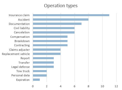
It’s not surprising that insurance claims are the most mentioned operation by customers, but it’s interesting to compare it with the mentions of other services such as the tow truck or the replacement vehicle. This information becomes more significant the larger the collection analyzed is.
Top products
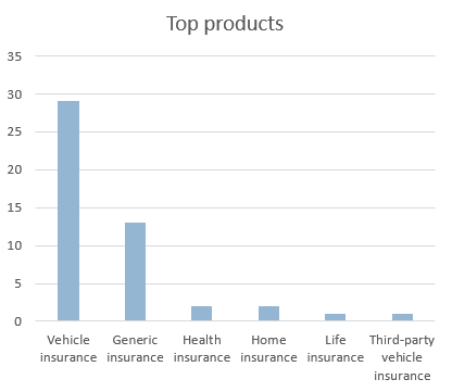
Another interesting insight is finding out the products mentioned by the customers. In combination with some of the other dimensions, it may give us information on which product is the most popular, which one is linked to more incidents or complaints, etc.
To extract this type of information, we will insert a new Clustered column chart with the field Label in Series, the Count of Label in Values and the field Dimension in Filters selecting only the value Product (to show only the labels corresponding to that dimension).
Not surprisingly, Vehicle insurance and generic references to an insurance are the most mentioned by far, but it’s worth noting that some products outside the scenario analyzed appear as well.
If we check out the texts where these other products appear, we find that they come from customers that have purchased more than one product in the same company. These mentions can give us an idea of the impact that customers who have acquired more than one product may have.
Polarity detected by dimension
One of the fields in the output of the VoC analysis is the polarity, specified for each one of the categories detected.
To visualize it, we will insert a new 100% Stacked bar chart with the field Dimension in Categories, the field Polarity in Series and Count of Label in Values. This shows the polarity distribution for all dimensions, and we can filter out the Polarity dimension — which is redundant — in Row Labels.
Here we can see that the dimensions that have the worst polarity values are Operation and Customer Service, which is what we would expect from this type of reviews.

Top 5 worst categories
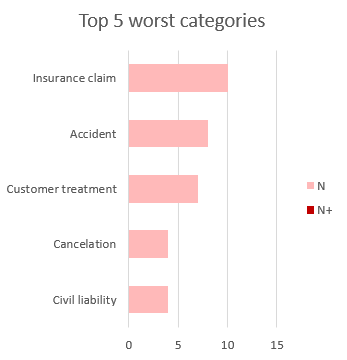
Keeping in mind the information we’ve seen in the previous chart, we can check in detail which categories from the dimensions Operation and Customer Service have the worst polarity. To do so, we are going to extract a “Top 5” of the categories with the most negative polarities associated.
We will insert a new Stacked bar chart with the field Label in Categories, the field Polarity in Series, the Count of Label in Values and the field Dimension in Filters, selecting the values Operation and CustomerService.
As we want to check only negative values, we will filter by N and N+ values in Column Labels. In the Row Labels, we will sort ascending by Count of Label, and in Value Filters, we will select Top 10 and filter the top 5 results by the Count of Label.
In the chart, we can see that Insurance Claim is the “winner”, which is not surprising, as, in general, it tends to be the most polemic aspect in any insurance and we’ve seen it’s one of the most mentioned operations.
Step 6: join everything
Once you have generated all the charts you want for your dashboard, you just have to move and arrange them on the VoC Dashboard sheet. When you update the data, if you maintain the name of the table, you will see in the dashboard the updated charts with the information available.
This is our resulting dashboard:
You can download the spreadsheet with all the charts here.
Once you are familiar with this type of analysis, you can change the dashboard to extract the information you need and present it in a way that’s easy to understand.
We look forward to seeing what you come up with! Remember that if you have any questions or doubts, we’ll be happy to answer them at support@meaningcloud.com!