Excel spreadsheets are one of the most extended ways of working with big collections of data. They are very powerful and they are very easy to combine and integrate with a myriad of other tools. Through our Excel Add-in we provide you a way of adding MeaningCloud’s analyses to your work pipeline. It’s very simple and it has the added benefit of not needing to write any code to do it.
In this tutorial we are going to show you how to use our Excel Add-in to do sentiment analysis. We are going to do so by analyzing restaurant reviews we’ve extracted from Yelp.
To get started, first you need to register in MeaningCloud (if you haven’t already), and download and install the Excel add-in in your computer. Here you can read a detailed step by step of the process.
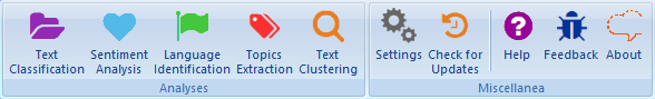
Once you’ve installed it, a new tab called MeaningCloud should appear when you open Excel. If you click on it, these are the buttons you will see.
The first thing you need to do to start using the add-in is to copy your license key and paste it on the corresponding field in the settings menu. You will only have to do this the first time you use the add-in, so if you have already used it, you can skip this step.
Once the license key is saved, you are ready to start analyzing!
As we have mentioned, we are going to analyze restaurant reviews extracted from Yelp, more specifically reviews on Japanese restaurants in London. You can download the spreadsheet we are going to use here and follow the tutorial as you read.
You will see that once you have the spreadsheet with the data loaded in Excel, it’s just a matter of a few clicks to have your texts analyzed.
Step 1: open the Sentiment Analysis interface
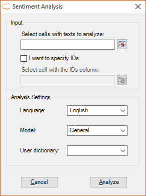
To do this you just have to click on the “Sentiment Analysis” button, the second one starting on the left. It will open the Sentiment Analysis interface, which you can see on the image on the right.
The interface has two different sections, “Input“, which allows us to select the data to analyze and “Analysis settings“, to configure parameters specific to the analysis.
Step 2: select the data to analyze
In the spreadsheet we are using, there are two columns with data:
- Column A, with the names of the restaurants the reviews are for.
- Column B, with the texts of the reviews.
The data we want to analyze is in column B, and goes from row 2 to row 40. The interface allows you to select the data to analyze in different ways, from writing the range manually to using Excel range selector or pre-selecting the range before opening the analysis interface, so use whichever suits you best.
The results will be output in a new sheet, so we don’t want to lose the reference of the restaurant the review is about. To do this, we will use the second field in the “Input” section: the IDs.
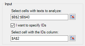
We just have to click on the checkbox to enable it, and then select a cell on the column we want to move with the texts we are going to analyze. In this case, any cell from column A will do.
The image on the right shows how the “Input” section looks after we have selected the data as described.
Step 3: configure the analysis
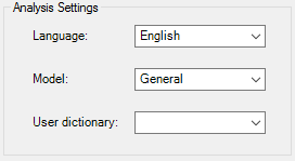
The second section, “Analysis settings” has three possible fields to configure: the language in which we are going to analyze the text, the model we are going to use, and if we are going to use an additional dictionary.
In our case, we want to analyze texts in English, so that’s the value we will set in the field “language“. For English there’s currently only one sentiment “model” available, general, so that’s the one we will use for the analysis.
The third field, “user dictionary“, allows you to select any of the user dictionaries you can define in the dictionaries customization console.
Once we have set all the values we want, the only thing left to do is click on the button “Analyze” to start the analysis.
When you do this, a progress bar will appear to show you the progress of the analysis. In the background you will be able to see how a new sheet with the results is created and how the values are written as they are received from the API.
When the process is finished, your excel spreadsheet will have two new sheets, Global Sentiment Analysis, with the global sentiment results of the texts and Topics Sentiment Analysis, with aspect-based sentiment analysis. You can read more about the output and how to configure it in the sentiment analysis in excel documentation.
Step 4: analyze the results
Now with this data you can carry out any analysis you want.
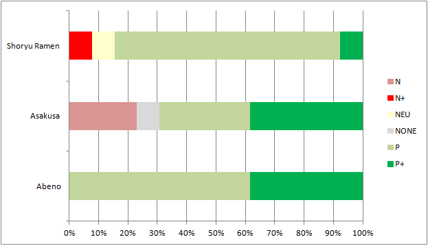
For instance, we have decided to create a pivot chart (which you can do from the Insert ribbon).
In that chart (we have selected a 100% stacked bar chart), if we select the fields ID and Polarity in the “PivotTable Field List” menu and then we drag the Polarity field both to the Values and to the Legend Fields areas, we will immediately obtain a graphic that shows us the distribution of the different polarities detected by the restaurant they refer to.
After changing the default colors to fit better the data, we obtain the chart on the right.
You can download the spreadsheet with the results, the analysis and the pivot chart here.
As you can see, you can carry out any type of analysis you want over the results, customizing them to the type of information you need and combining them with the tools provided by Excel.
Stay tuned for our next tutorial, in which we will tackle how to extract with MeaningCloud and Excel tailor-made aspect-based sentiment analysis. And of course, if you have any questions, we’ll be happy to answer them at support@meaningcloud.com