In the previous tutorial we published about Sentiment Analysis and MeaningCloud’s Excel add-in, we showed you step by step how to do a sentiment analysis using an example spreadsheet. Then we showed you a possible analysis you could obtain with its global polarity results.
In this tutorial we are going a bit further: instead of analyzing the global polarity obtained for different texts, we are going to focus on the analysis of different aspects that appear in them and how to use our dictionaries customization console to improve them and to extract easily the exact information you are interested in.
We are going to work withe same example as before: reviews for Japanese restaurants in London extracted from Yelp. If you don’t have it already from the previous tutorial, you can download the spreadsheet with the data here.
If you followed the previous tutorial, you will remember that when you run the sentiment analysis without changing its default settings, two new sheets appear: Global Sentiment Analysis and Topics Sentiment Analysis. Topics Sentiment Analysis shows you the concepts and entities detected in each one of the texts and the sentiment analysis associated to each one of them.
But what can we do when these are not the aspects of the text we are interested in analyzing? This is where our customization tools come in. Our dictionaries customization console allows you to create a dictionary with any of the concepts or entities you want to detect in your analysis, down the type you want them to have associated.
So how do we create this user dictionary?
Step 1: create a new dictionary
To do this you just have to access the dictionaries dashboard (available once you log in to your MeaningCloud account) and click on the big plus sign.
This will open a dialog where you can define the name of your new dictionary (in our case we are calling it “Restaurants“) the language we are defining it for (English), and optionally, a description of the dictionary’s purpose.

Step 2: add entries
Once we have created the dictionary, we can start adding the entries we want to detect in the sentiment analysis. In this scenario we want to detect two different aspects: dishes the restaurants serve and qualities of restaurants people talk about in their reviews.
To create an entry we need to know three things: the entry we want to detect (its lexical form), if we want it to be an entity or a concept (its entry type), and the type we want to associate to it (its ontology type).
Usually the form and the ontology type are quite immediate; the entry type, not so much. A rule of thumb for this is to think of how it’s going to appear in a text and thus, how we want to be able to detect it.
For instance, if we want to add “pork belly bun” as a dish, we can guess that they will also be mentioned in plural, while when we talk about other dishes such as “ramen” or “sushi“, we are only ever going to find them like that (we don’t talk about “ramens” or “sushis“). Concepts automatically consider morphological variants as aliases, which means that if we want the plural (or the gender for languages other than English) to also be detected, we can define the entry as a concept, and we won’t have to add it as an alias.
In the following image you can see how we are going to create the entry for “ramen“. We are going to define it as an entry of the type Dish, a subtype in the type Restaurants:
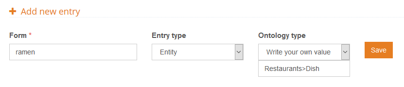
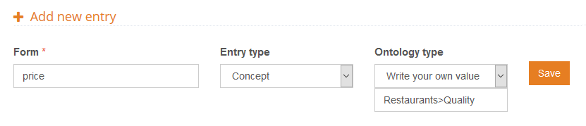
As you can see, when we define our own ontology type, we use the character greater than, ‘>’, to indicate hierarchy. Much in the same way as this example, we are going to define restaurant qualities, which we will associate to the ontology type Quality (also be a subtype of Restaurants):
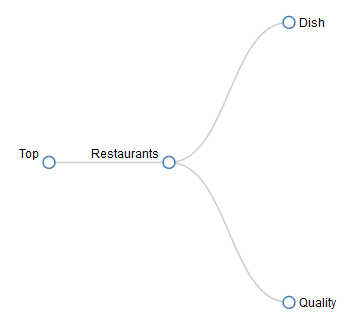
Using this criteria to define the ontology types of the entities and concepts we want to detect, we will be able to have them neatly grouped under the same first level type, which will make it easier to work with the results later on.
For this tutorial and following the considerations we’ve just described, we are defining the following terms:
- Dishes: ramen, sushi, gyoza, pork belly bun, brussel sprout tempura, curry ramen, sashimi, fried miso eggplant, miso soup, udon noodles, okonomiaki
- Qualities: price, portions, staff, ambience
If you do not want to create manually all these entries, you can download this file, and import it directly into your empty dictionary using the default configuration that appears in the import dialog.
Step 3: configure the analysis to use the dictionary
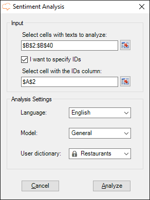
Now that we have defined our dictionary, we can use it in the sentiment analysis we are doing using the Excel add-in.
Configuring it is very easy: when you click on the sentiment analysis button, the dictionaries created with the license key you have configured in the Settings section of the add-in will appear automatically in the User dictionary field.
You just have to select which dictionary you want to use, in our case “Restaurants“, and then click on Analyze to start the sentiment analysis.
But before starting the analysis, we are going to change something else in the Settings section in order to make it easier to work with the results later on: instead of combining cells when several concepts/entities are detected for the same text, we are going to repeat the text for each element detected.
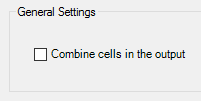
To do this, you just have to deselect the option “Combine cells in the output” in the General settings section in Settings.
You can read more about the different configuration options available in the documentation for sentiment analysis in excel.
After clicking on Analyze, the process will launch, creating two new sheets in your spreadsheet when it’s done: Global Sentiment Analysis, with the global sentiment results of the texts and Topics Sentiment Analysis, with aspect-based sentiment analysis. We talked about the first one in the previous tutorial, so now we are going to focus on the second one.
Step 4: analyze the results
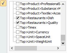
The first thing we can see is that there are more results than the ones we have defined in our dictionary, which makes it a bit hard to focus on what we really want. This is where the ontology types we have defined come in: if we enable the AutoFilters in the first row of the results, we can obtain a view with just the entries we are interested in.
To do so, just click on one of the title cells, and then in the Data ribbon, click on Filter. In the filter associated to the column Type, we can select the two types we’ve defined: Top>Restaurants>Dish and Top>Restaurants>Quality.
With the new results we can see review by review the dishes that are talked about, and what clients think about the different qualities of a restaurant that we have defined in our dictionary. With this information and using Excel’s tools, we can obtain easily analyses as simple or as complex as we want.
These are two examples of pivot charts you can create (click on them to make them bigger):
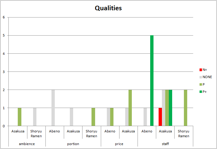

We’ve obtained both charts by inserting a pivot chart from the filtered data. For the first one we’ve chosen a clustered column chart. To configure it, we’ve set the following:
- In the Axis fields area, the fields Form and ID, in that order.
- In the Report filter area, the field Type filtering by Top>Restaurants>Qualities.
- In the Legend fields area, the field Polarity.
- In the Values area, the field Polarity configured as “Count of Polarity”.
After that, and tweaking a bit the colors, we obtain the graphic on the right, where we can compare the polarities detected in the reviews for the same qualities for each one of the restaurants.
The second chart is pretty similar to the first one. This time we are using a clustered bar chart, and the configuration changes in two things:
- Instead of filtering by qualities, we are selecting the dishes, so the field Type filters now by the value Top>Restaurants>Dishes.
- The order of the fields in the Axis fields area changes: ID will appear first and then Form.
In this second chart we can see the different opinions the reviews offer on the same dishes, so for instance, we can see that the ramen in Shoryu Ramen has mixed the reviews, while the okonomiaki in Abeno seems to be a hit.
You can download the spreadsheet with the results and the analyses we have just described here.
As you can see, detecting the polarity for you specific domain is fairly easy, and once you’ve defined what you need, you can combine it with any kind of analysis you want to add to your usual workflow.
Stay tuned for our next tutorial, in which we will show you how to improve the sentiment analysis in your domain by using sentiment analysis. And of course, if you have any questions, we’ll be happy to answer them at support@meaningcloud.com.