Voice of the Employee gathers the needs, wishes, hopes, and preferences of all employees within an organization. The VoE takes into account both explicit needs, such as salaries, career, health, and retirement, as well as tacit needs such as job satisfaction and the respect of co-workers and supervisors. This post follows the line of Voice of the Customer in Excel: creating a dashboard. We are creating another dashboard, this time for the Voice of the Employee.
Text-based data sources are a key factor for any organization that wants to understand the “whys”.
Things can often go wrong in organizations. It is important to catch those potentially damaging problems before they turn into a major crisis.
VoE programs typically use a variety of methods to collect and analyze employee feedback, including surveys such as eNPS or 360º assessments, exit interviews, employee forums, social networks or focus groups.
In our professional experience at MeaningCloud, we have found that some specialized labor climate consultants only process closed questions (multiple-choice). And when they are faced with the challenge of analyzing thousands of employee suggestions through open-ended questions, they would manually analyze a 1% sample of the responses and feel perfectly content with it.
To overcome this challenge, text analytics technology automatically processes and analyzes the text content and supplies valuable information, transforming that “raw” data into structured, manageable information.
At MeaningCloud, we have developed and shared three different models that are available from both the website’s Voice of the Employee Demo and the Developers section.
-
Performance Review: Analyze the performance reviews of your employees. Sources are regularly open-ended questions in different surveys such as eNPS or performance reviews.
-
Organization. Analyze employees’s opinions about the company. Typical sources include employee forums, social networks or focus groups.
-
Exit Interview, to analyze why employees leave the company.
In addition to these, MeaningCloud for Excel is an add-in for Microsoft Excel that allows you to easily embed our text analytics functionality into spreadsheets. There is one Excel add-in specifically developed for Voice of the Employee analysis.
In this tutorial, as in the previous post on Voice of the Customer, we will show you how to use the Excel add-in developed for the Vertical Pack, how to carry out a VoE analysis and how to create a dashboard.
The Sources
The reviews used for this post have been extracted from:
https://www.indeed.com/cmp/Walmart/reviews
You can download the Excel file containing the source data.
Step 1: obtaining the VoE analysis
Follow the instructions at https://www.meaningcloud.com/blog/voice-of-the-customer-excel-dashboard
Once the settings are configured, select the data you want to analyze and click the “Voice of the Employee” button. In the dialog that appears, define the ID column as the ID, English as the language, Organization as the analysis domain, and then click Analyze. If you have any questions about the data selection, check our previous tutorial on getting started with our add-in for Excel.
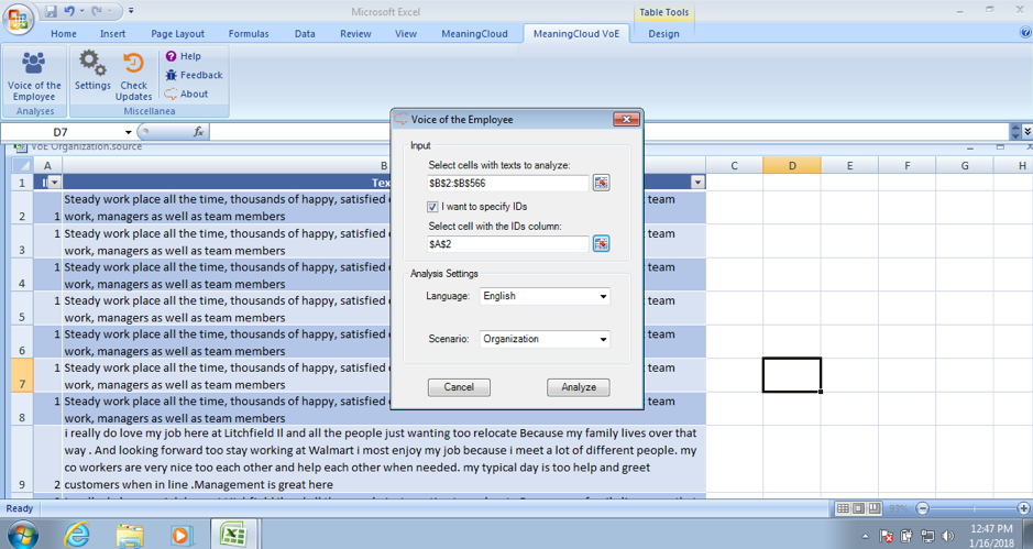
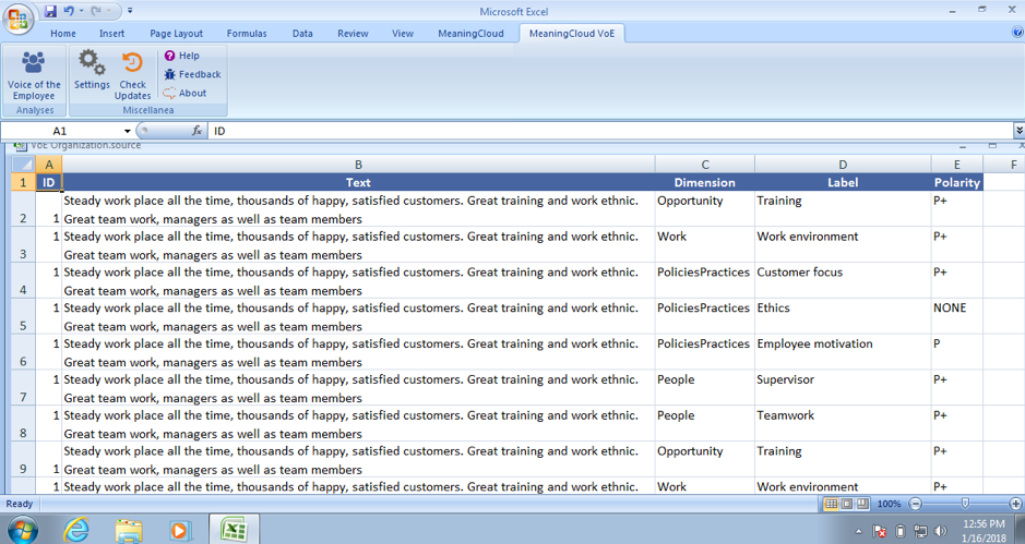
The resulting table will have five columns: ID, Text, Dimension, Label, and Polarity. It will look like this:
Step 2: Preparing the Data
Follow the instructions at https://www.meaningcloud.com/blog/voice-of-the-customer-excel-dashboard
We will call our table “VoE“.
Step 3: Creating the First Chart
The graphs in this post have been developed with Microsoft Excel 2016 for Window. Some of the graphs might not be available for earlier versions.
-
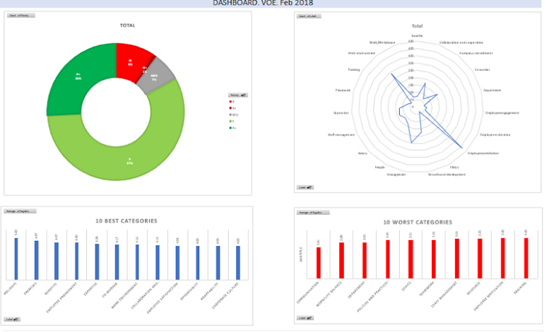
Polarity_labels_donut
The first chart we are going to create will display the distribution of polarity by label of all our data. It will give us an idea of the general sentiment of employees.
To create this chart, select the VoE table (by going to the top-left part of the table and clicking where the diagonal arrow appears) and then click the PivotChart button in the Insert tab.
Since the VoE table is already selected, it will appear in the Create PivotChart dialog as the data to analyze. After clicking OK, just configure the fields to use in the chart.
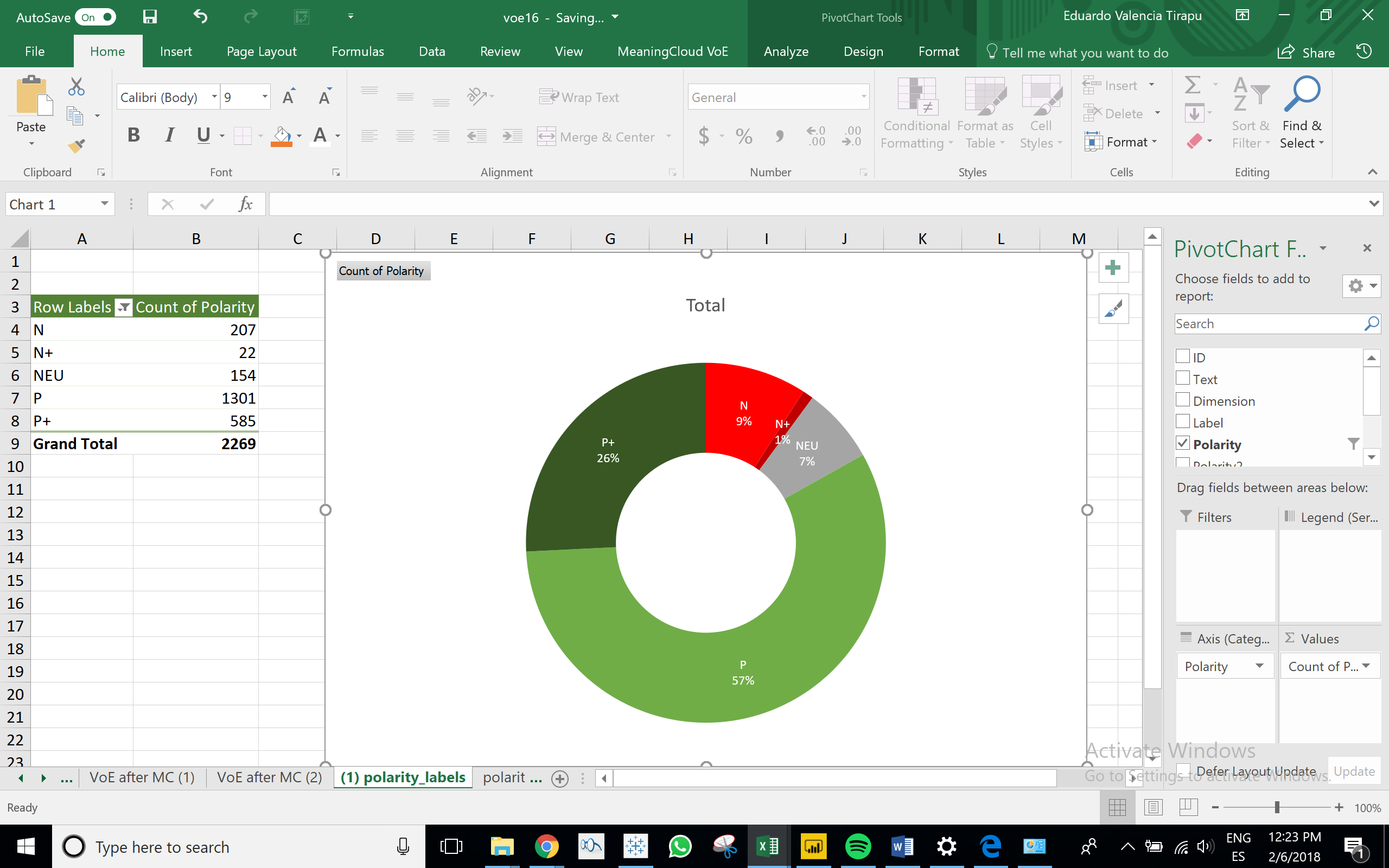
For this chart, add the field Polarity to Categories, and Count of Label to Values. Then, in the Design tab, click Change Chart Type and select Doughnut.
We can change the style of the chart to make the information easier to understand, either by using Excel’s predefined chart styles or by modifying the different chart elements as needed.
Step 4: Creating Four Additional Graphs
(2) Label-Radar
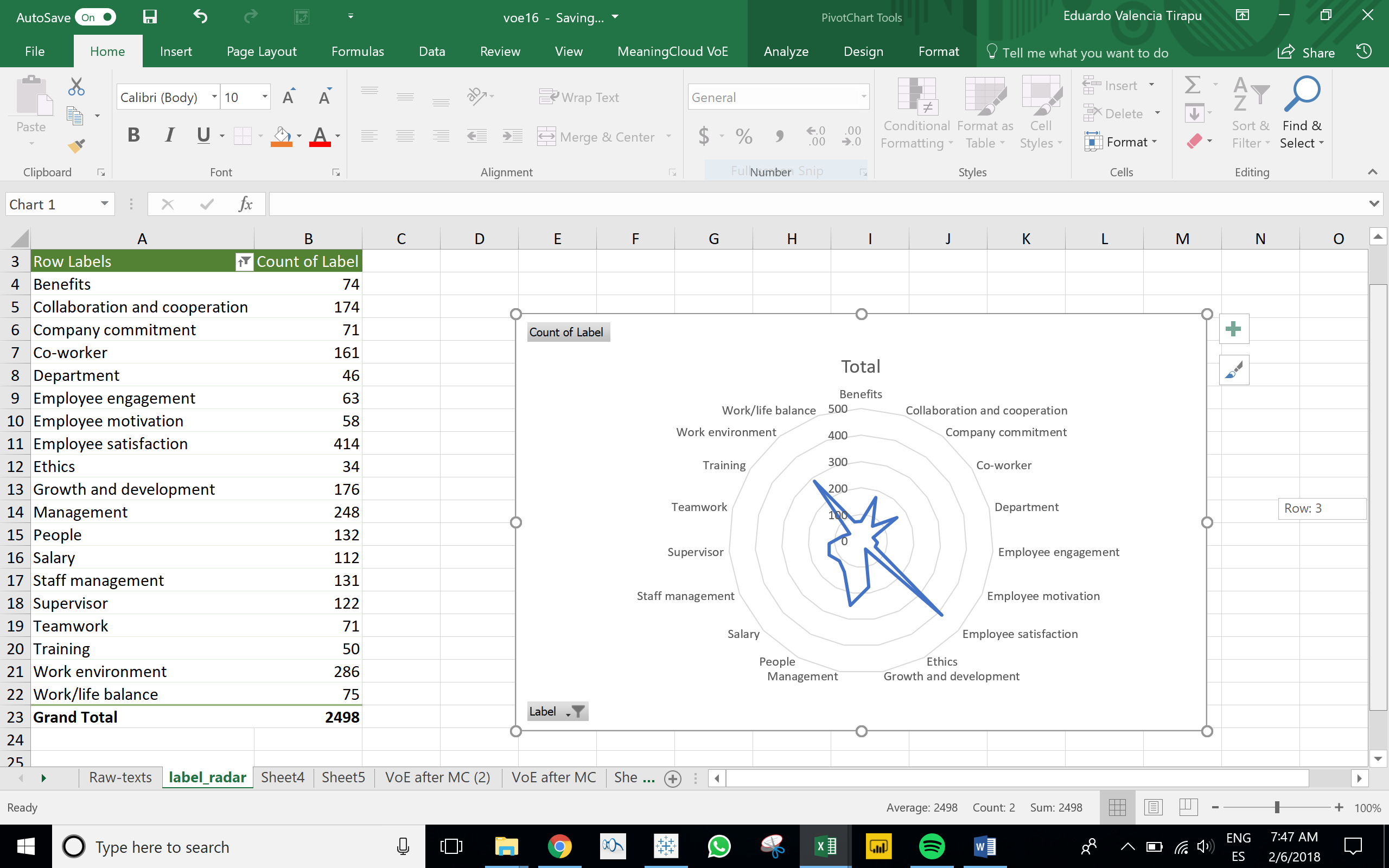
For this chart, we will add the field Dimension to Categories, and Count of Label to Values. Then, in the Design tab, we will click on Change Chart Type and select Radar.
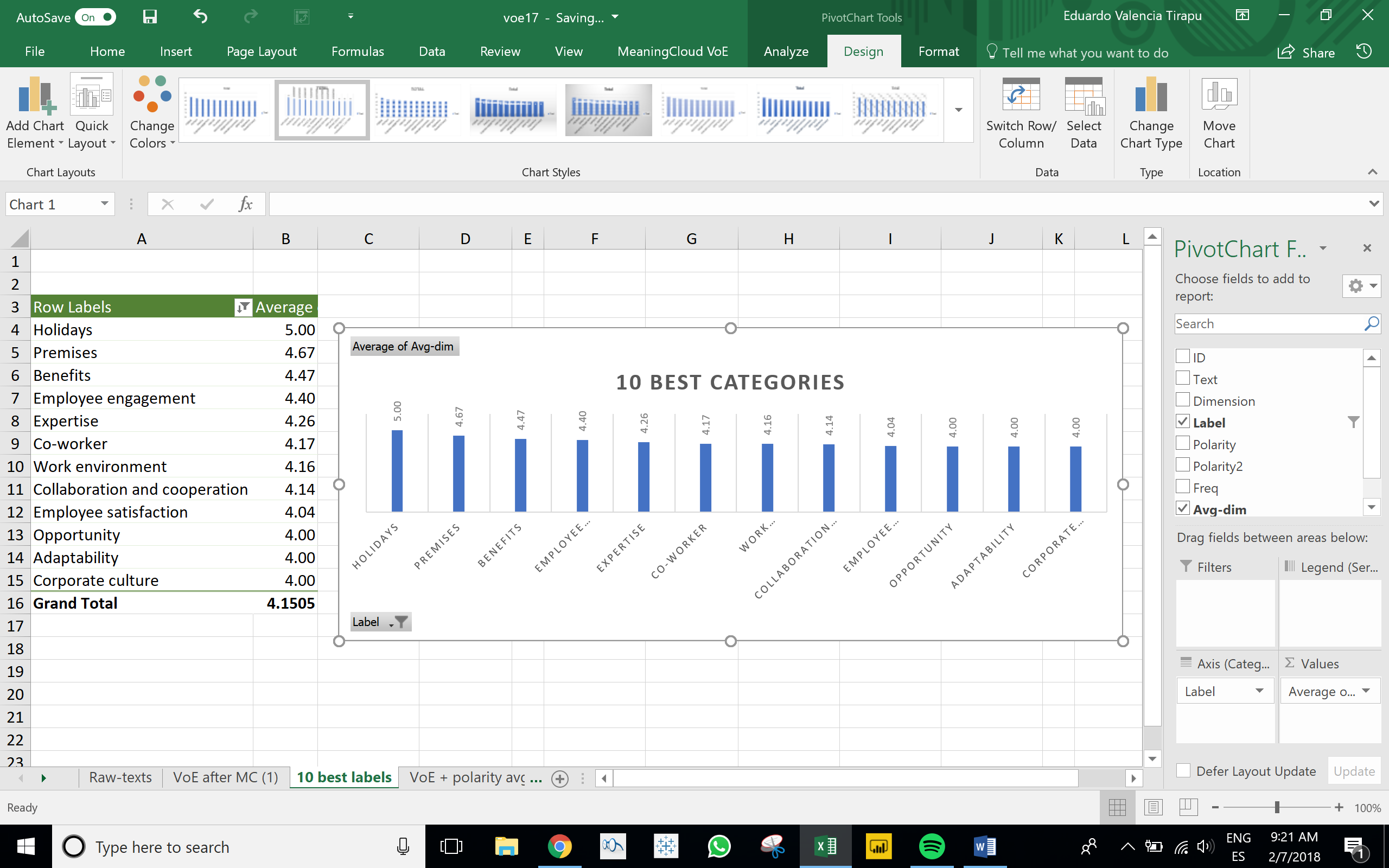
(3) Ten Best Categories
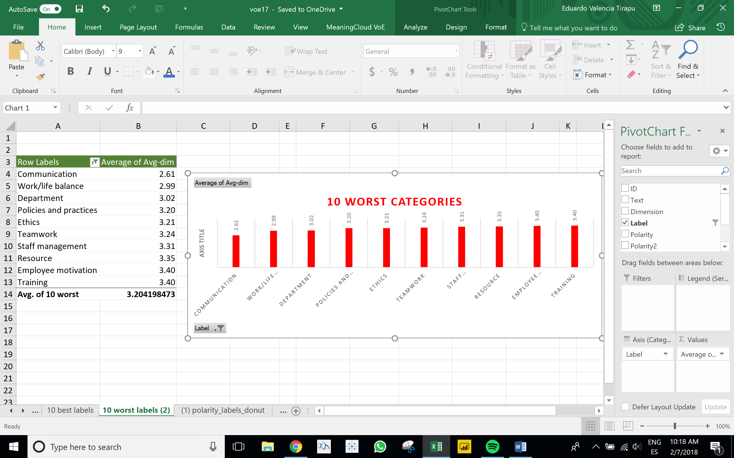
(4) Ten Worst Categories
(5) Treemap of Dimensions and Labels
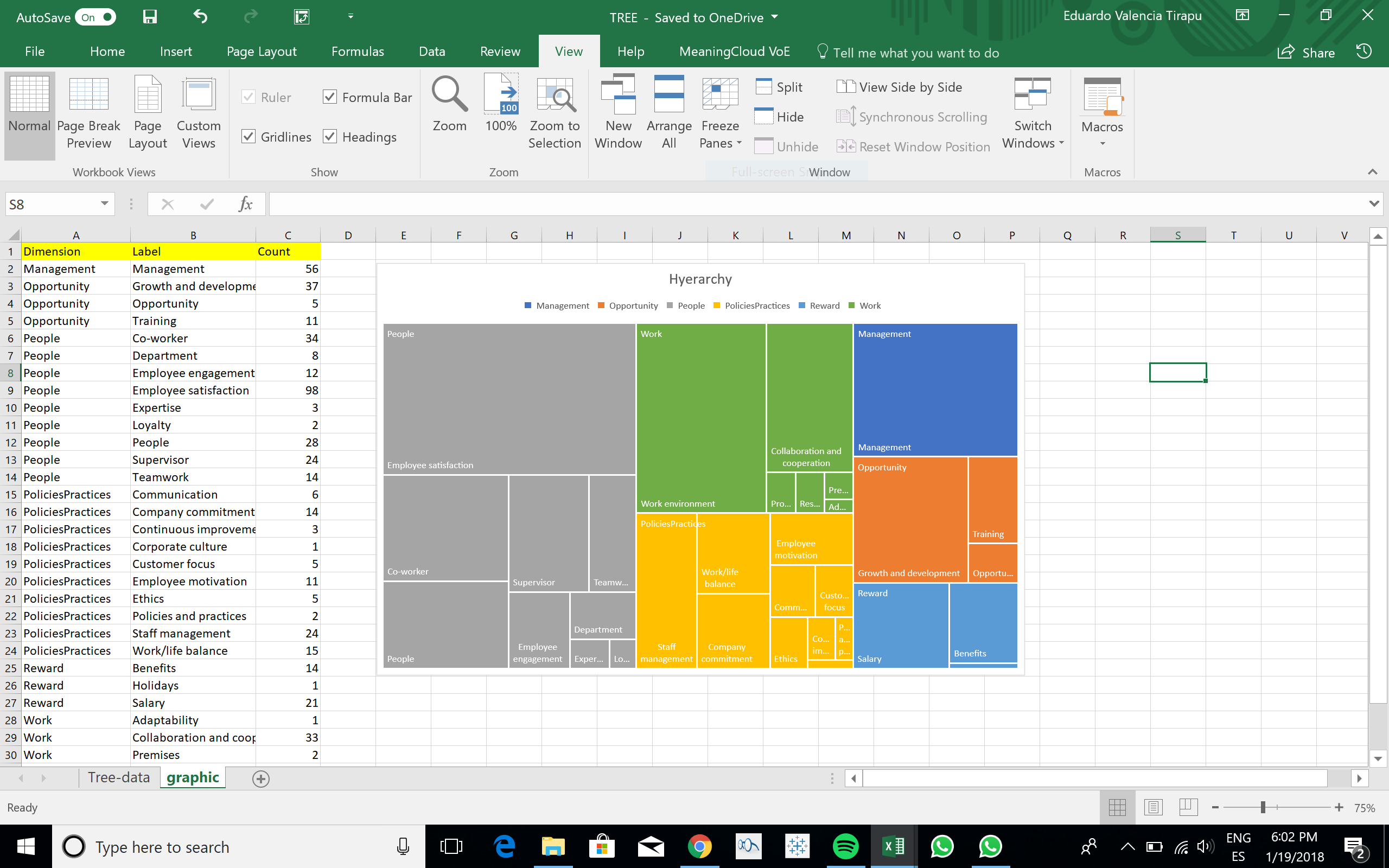
For this graph, you can’t work with a Pivot Table as in the previous charts. This type of chart requires a regular table with a hierarchy of values similar to the one in the screen capture below.
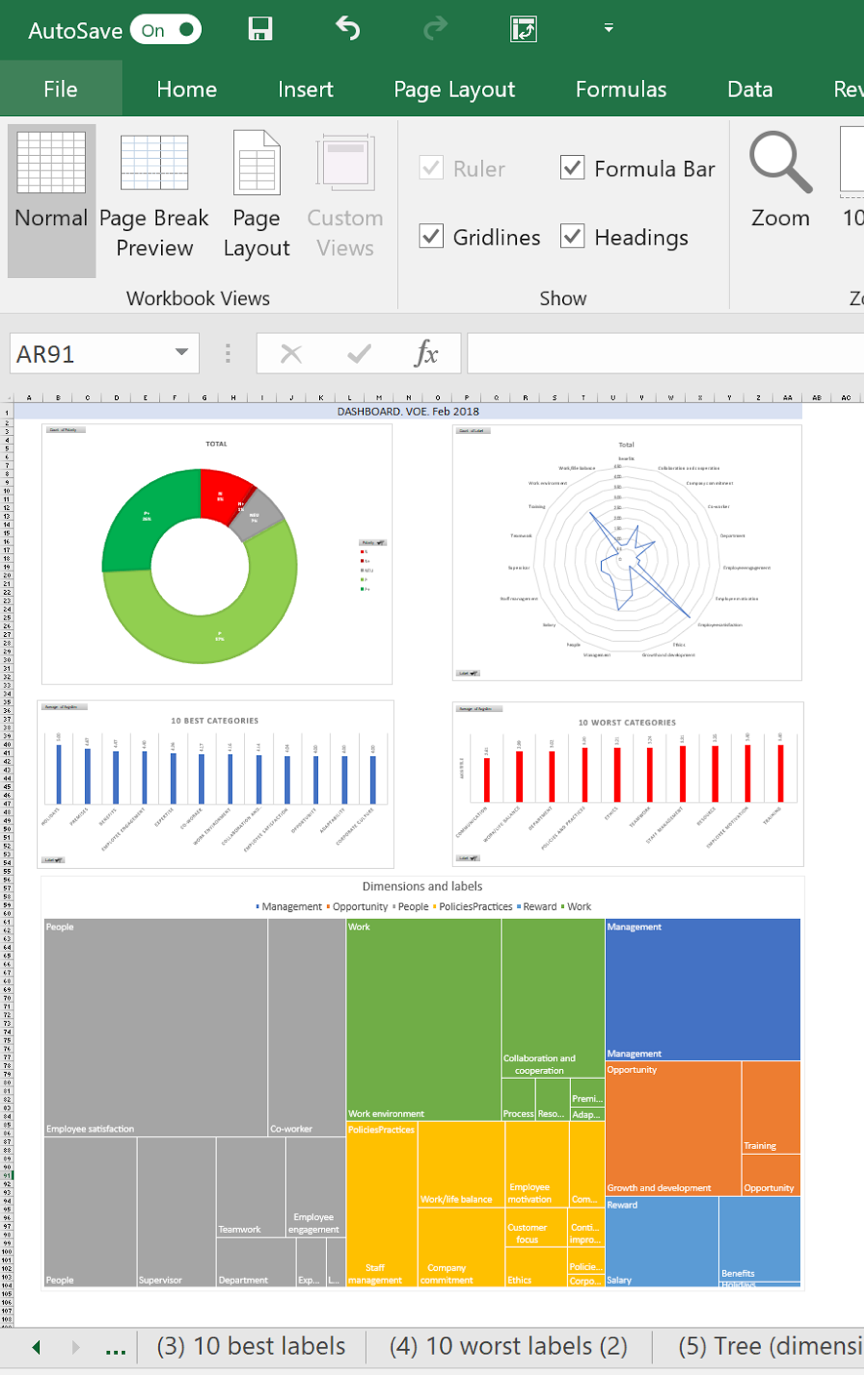
Step 5: Creating the Dashboard
For the dashboard, create a new sheet named VoE-DASHBOARD.
Go back to the (1) polarity_labels_donut sheet, and in the Design tab, click Move chart and select Object in VoE-DASHBOARD to move it to the sheet you’ve just created.
Step 5: Adding More Charts
To add the rest of the charts to the dashboard, you follow a process similar to the one described in the first chart: go to the sheet, Move chart and select Object in VoE-DASHBOARD
When you resize and place the chart as needed, the result looks like this:
You can download the spreadsheet with all the charts here.
Once you are familiar with this type of analysis, you can change the dashboard to extract the information you need and present it in a way that’s easy to understand.
We look forward to seeing what you come up with! Remember that if you have any questions, we’ll be happy to answer them at support@meaningcloud.com!